How can we help?


The Engagement 4Cast

The “donor journey”—the process your supporter embarks on, from the moment they land on your website to the completion of your donation form—is key to the success of your campaign. How straightforward and uncomplicated are your forms? How smooth is the process you’ve created for your members and supporters? A bumpy ride or tricky process might mean missed chances and supporters abandoning the trip. Here are our top 10 tips for nonprofits to significantly improve completion rates.
If you are experiencing the challenge of high form abandonment rates, it may be that your donation or membership forms are too long and complicated. Users often feel overwhelmed and frustrated by the sheer amount of information they need to provide in one go, leading to incomplete submissions and lost contributions.
Solution:
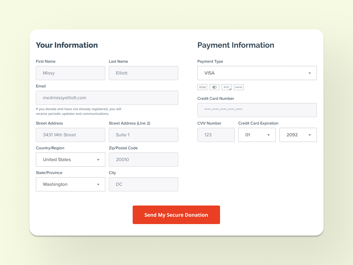
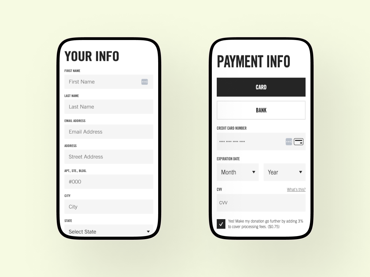
Break down complex forms into smaller, manageable sections to guide users through the process step-by-step, reducing cognitive load and making the task seem less daunting. Create scannable forms, where information is organized logically. Or consider designing a multi-step donation form that starts with a selection of donation options, followed by a section for entering personal details, and concluding with payment information.
The use of jargon or vague instructions can lead to frustration, errors, and ultimately, lost donations or memberships. If your website’s visitors find the information fields confusing or unclear, it can lead to inaccurate submissions or abandonment. This can be particularly problematic in donation and membership forms, where error-free information is crucial for processing contributions and maintaining records.
Solution:
Well-defined labels and organized forms convey professionalism and reliability, encouraging users to trust your organization and confidently complete their transactions. Clear and concise labels significantly improve the user experience and accuracy of form submissions. Opt for straightforward language that aligns with the audience and avoids jargon or technical terms they may not understand. Present form fields in categories, such as “Personal Information” and “Donation Details,” to further reduce confusion and build trust.
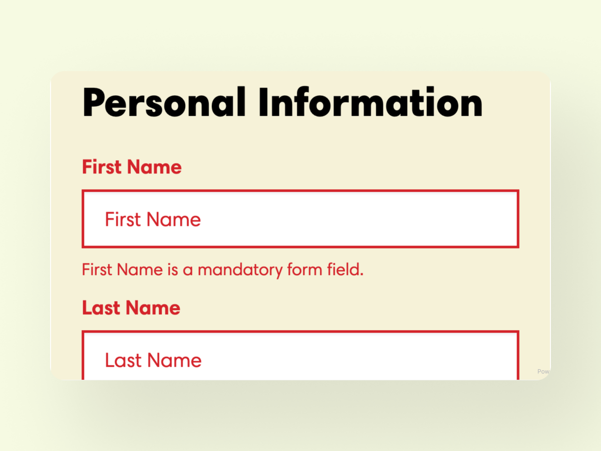
Nothing is more frustrating for users than filling out a form only to be met with an error message after submission. This delayed feedback can lead to confusion and discouragement, causing many to abandon the form entirely.
Solution:
Provide real-time feedback by implementing inline validation to enhance the user experience. As users fill out the form, errors and success messages should appear next to the relevant fields. This immediate feedback allows users to correct mistakes on-the-spot, reducing frustration and increasing the likelihood of form completion. By helping users submit accurate information on the first try, your nonprofit can improve form completion rates and ensure smoother interactions with your supporters.
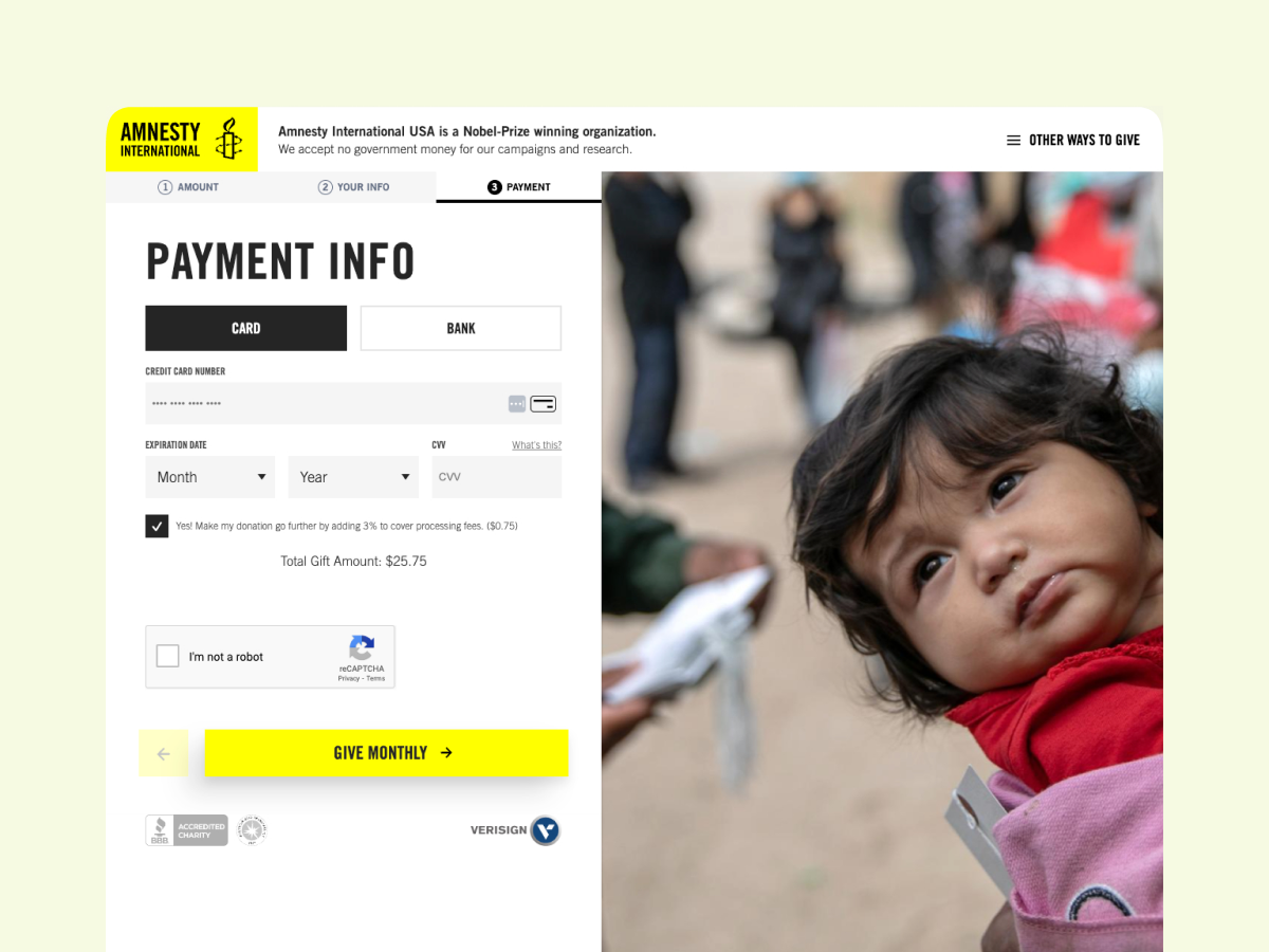
Sometimes, incorporating multi-step forms isn’t enough. If longer forms do not provide a visual indication showing how far they are in the process, your users may feel overwhelmed and unsure about how much time and effort will be required to complete the form. This uncertainty can lead to frustration and a higher likelihood of users abandoning the process.
Solution:
To address this issue, incorporate progress indicators. Progress bars or step numbers provide users with a clear visual representation of their progress, showing them how far they’ve come and how much further they need to go. This transparency helps manage users’ expectations and reduces the feeling of being overwhelmed.
Progress indicators are motivating, encouraging users to complete your form by breaking down the process into manageable steps. When users see that they are making tangible progress, they are more likely to continue to the end.
Your supporters may be turned off by the time-consuming nature of manually entering information. When they are required to fill out extensive forms, especially for donations or advocacy, the repetitive task becomes tedious. This friction leads to higher drop-off rates and incomplete forms, negatively impacting your nonprofit’s ability to collect essential data and support.
Solution:
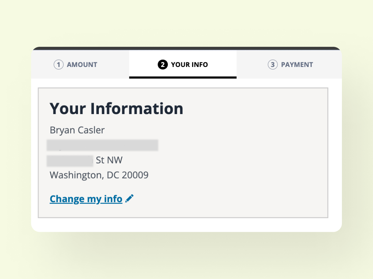
Employ auto-fill and smart defaults that can streamline the form-filling process. By pre-filling information from previous interactions or user accounts, or by providing default responses, your nonprofit can significantly reduce the manual input required from your users.
Our product, TidyContact, exemplifies this approach by transforming advocacy and donation forms into smart forms that automatically clean up supporter data before it enters your database. For example, if a form requires a phone number, TidyContact will auto-populate the donor’s country code based on their IP address.
ENgrid, another product of ours, is a robust framework for optimizing Engaging Network page templates, which includes a “Welcome Back” feature that streamlines the experience for returning users. When enabled and triggered, this component will hide the personal details form on the page and can show two elements:
The fewer required fields, the higher the likelihood of form completion. When your users are met with a lot of required fields, they often feel overwhelmed and discouraged, leading them to abandon the form altogether.
Solution:
Minimize the number of required fields on forms, focusing solely on essential information needed to complete transactions. You can collect additional details at a later stage. Ensure that the initial interaction is as seamless and frictionless as possible. By focusing on collecting only the most crucial information upfront, your nonprofit can create a more user-friendly and efficient process.
Many nonprofits face the challenge of low engagement and high abandonment rates on their online forms because those forms are not optimized for mobile devices. A significant portion of your users will access your website from their smartphones. Forms that are not mobile-friendly can be difficult to navigate, read, and complete. This can frustrate potential donors and volunteers, leading them to abandon the process entirely.
Solution:
Ensure that your forms are mobile-friendly. Design forms that seamlessly adapt to various screen sizes and orientations. Simplify navigation and minimize the need for zooming or excessive scrolling to improve usability. To achieve this, it’s crucial to test forms thoroughly on a variety of devices, including smartphones and tablets. This ensures a smooth and user-friendly experience, with accessible buttons, input fields, and text that is easily readable on smaller screens.
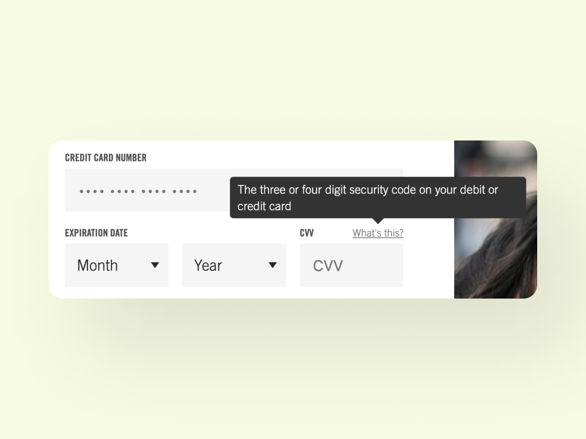
Your supporters may experience confusion or uncertainty if they encounter fields that require additional clarification or guidance. This leads to frustration and eventual abandonment of the form.
Solution:
Implement assistance features such as tooltips or contextual help. Tooltips are small pop-up explanations that appear next to fields, providing users with brief, relevant information or instructions on how to complete the field accurately.
Additionally, integrate a help icon or link to a FAQ page to offer users access to more detailed explanations without overwhelming them with excessive information upfront. These make your users feel supported and informed, which can build trust and confidence in their online interactions with your nonprofit. They also enable users to navigate through your forms more confidently, reducing the likelihood of errors.
Organizations are increasingly grappling with concerns over data security and privacy. Many potential users hesitate to complete online forms due to fears of their personal information being compromised or misused. Without clear communication and assurances of robust data protection measures, you risk losing trust and credibility, which can impede your ability to foster engagement and maintain digital relationships.
Solution:
Proactively address these concerns by prioritizing data security and privacy for your online forms. Implement secure connections (HTTPS) to ensure that data transmitted between your users and your website is encrypted, protecting it from interception by unauthorized parties. Display trust badges or certifications from recognized security providers to reassure users of your nonprofit’s commitment to safeguarding their information. Clearly communicate your data protection policies on the form itself or through a privacy policy link to build trust and transparency.
Every nonprofit’s audience is unique, and what works for one may not work for another. Testing various aspects and elements of your donation form is crucial to make sure it resonates with your audience, as usability issues, confusing layouts, or unclear instructions can result in missed opportunities for engagement and fundraising. Without a systematic approach to gathering and analyzing user feedback, your organization risks perpetuating these barriers to form completion and donor retention.
Solution:
Adopt a strategy of continuous testing and iteration of your online forms. By regularly soliciting feedback from users through surveys, usability testing sessions, and analytics, you can identify friction in the form-filling process. Perform A/B testing using different layouts, form designs, and buttons to determine which variations lead to higher conversion rates.
When nonprofits collaborate with us at 4Site, our strategists don’t just offer recommendations based on past successes; we understand the importance of testing these suggestions for each unique client to ensure their forms are optimized for their specific audience. We provide a structured system to track various tests from hypothesis to outcomes, ensuring that each test is strategically aligned with a goal and leads to actionable enhancements. Our approach ensures that every experiment directly contributes to improving forms or campaigns. If you couldn’t tell, we love testing and would be thrilled to discuss how we can structure your A/B and multivariate testing initiatives!
Contact us and let’s nerd out on data together!
By prioritizing user-centric design and responsiveness to feedback, your organization can effectively attract and retain donors, strengthening support for your mission-driven initiatives.
By adopting these best practices, your nonprofit will transform its online forms into a seamless experience that guides its visitors effortlessly towards completion. Implementing simplified structures, clear labels, intuitive progress indicators, and mobile optimization will enhance user engagement and boost completion rates on your forms.
At 4Site, we’re passionate about helping nonprofits thrive online. Whether you’re looking to streamline your donation forms or optimize user experiences, we’re here to support you every step of the way. Let’s work together to create impactful solutions that resonate with your audience, drive meaningful results, and empower your organization’s mission through effective digital strategies.

4Site Studios is a talented troupe of web professionals who are passionate about creating tools to support digital marketers. We love to hear from our community! Reach out to us with your thoughts and questions. And don’t forget to subscribe below to get notified when we post new blogs – no spam, just content👍🏼
Subscribe to the Engagement 4Cast.