How can we help?


The Engagement 4Cast

Making a website accessible is essential to providing a great online experience for all users, including those with disabilities. However, accessibility can be time-consuming to implement, and if not done properly, it can degrade the design and functionality of a site. But there are a few easy things you can do to incorporate inclusive practices into your existing design process. These changes will go a long way to ensure all users have a good experience without breaking the bank.
We recently collaborated with Save the Children Action Network (SCAN) on their website redesign, an exciting project that allowed us to implement a range of best practices to ensure their site is welcoming and usable for everyone. Drawing from this experience, our talented Creative Director, Tayo Olayinka, compiled a simple guide to help you maintain accessibility when designing your next website.
Color contrast is the difference in light between your text and its background. When your text stands out against its background, it’s easier to read for everyone, including people with visual impairments.
Use Contrast Checkers: Online tools like this Contrast Checker or the WebAIM Contrast Checker can help you find the right balance.
Stick to Guidelines: Aim for a contrast ratio of at least 4.5:1 for normal text and 3:1 for large text. The w3.org has a great quick reference guide to assist with making content distinguishable.
Throughout the redesign, we prioritized color contrast and accessibility compliance on SCAN’s website. Except for the primary call-to-action (CTA) buttons, the entire site adheres to the Web Content Accessibility Guidelines (WCAG) AAA standard, maintaining a minimum contrast ratio of 7:1. The primary red CTA buttons mostly meet WCAG AAA compliance, with smaller instances meeting the WCAG AA standard with a contrast ratio of 4.86:1 (above the minimum requirement of 4.5:1).
To better enhance contrast and legibility further, we created a system separating text from imagery. Most design components use flat background colors instead of being placed over images. The exception is the highly-designed hero section on the homepage (see below), where we applied a scrim over the image to promote text legibility.
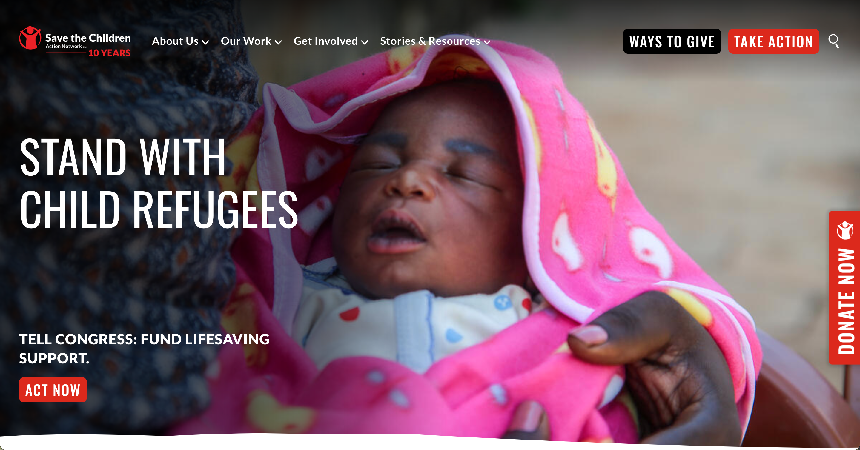
To achieve the required color contrast, we tested the lightest possible background values with the scrim against white text. At its lightest color behind the descriptive text (Hex ~#747475), the background provides a contrast ratio of 4.66:1 for white text, meeting the WCAG 2.0 Level AA compliance for regular text. Large text provides a contrast ratio of 3.49:1, meeting the WCAG 2.0 Level AA compliance for large text (the requirement is 3:1).
Small text can be difficult to read, especially for those with visual impairments or older adults. The WCAG recommends that text be resizable up to 200% without losing content or functionality, which is easier to achieve with a larger default font size. Starting with a reasonably large font size ensures text remains clear and undistorted when zoomed, and it adapts better across different platforms and devices.
Minimum Size: Use a base font size of at least 16 pixels.
Scalable Fonts: Allow users to adjust text size according to their preferences.
Consistency: Maintain a consistent type hierarchy to guide users through your content.
For the redesign, we established a type hierarchy with an 18px base font size to increase legibility on SCAN’s website. We used all-caps strategically: for headlines, it enhances attention-grabbing legibility and quickly conveys section information; for small labels, it improves character distinctiveness within confined spaces.
Using color alone to convey information can be challenging for users with color blindness or visual impairments. It also makes it difficult for people viewing your site in varying light conditions, such as bright sunlight. To enhance accessibility, integrate additional design elements that can help guide your users.
Use Text Labels: Combine color with text labels or icons.
Shapes, Patterns and Motion: Utilize these design elements to distinguish various components.
Underlines for Links: Underline links instead of just changing their color.
Larger target sizes: Under the “Creating Usable Target Size” section, TetraLogical reminds us the importance of size and space with interaction icons and elements
In addition to changing the color, we added a motion cue to SCAN’s standard buttons that causes them to elevate on the y-axis when hovered over. This design ensures that users with vision impairments can recognize the button’s interactivity, as the motion provides an additional indicator and doesn’t rely solely on its color change.

We also applied this motion cue to cards on the homepage, where the title is embedded in the image and reveals additional text on hover. To see these buttons and cards in action, visit https://savethechildrenactionnetwork.org/.
Alt tags describe images for users who can’t see them, including those using screen readers. They can also be helpful for when the images on your page fail to load. And bonus – they’re also essential for SEO.
Be Descriptive: Clearly describe the image content.
Keep It Relevant: Ensure the description matches the context of the surrounding content.
Avoid Redundancy: No need to start with “Image of…”— just describe the image!
Use Keywords: Using popular search terms in your description, without being deceptive, can help the right people find your site.
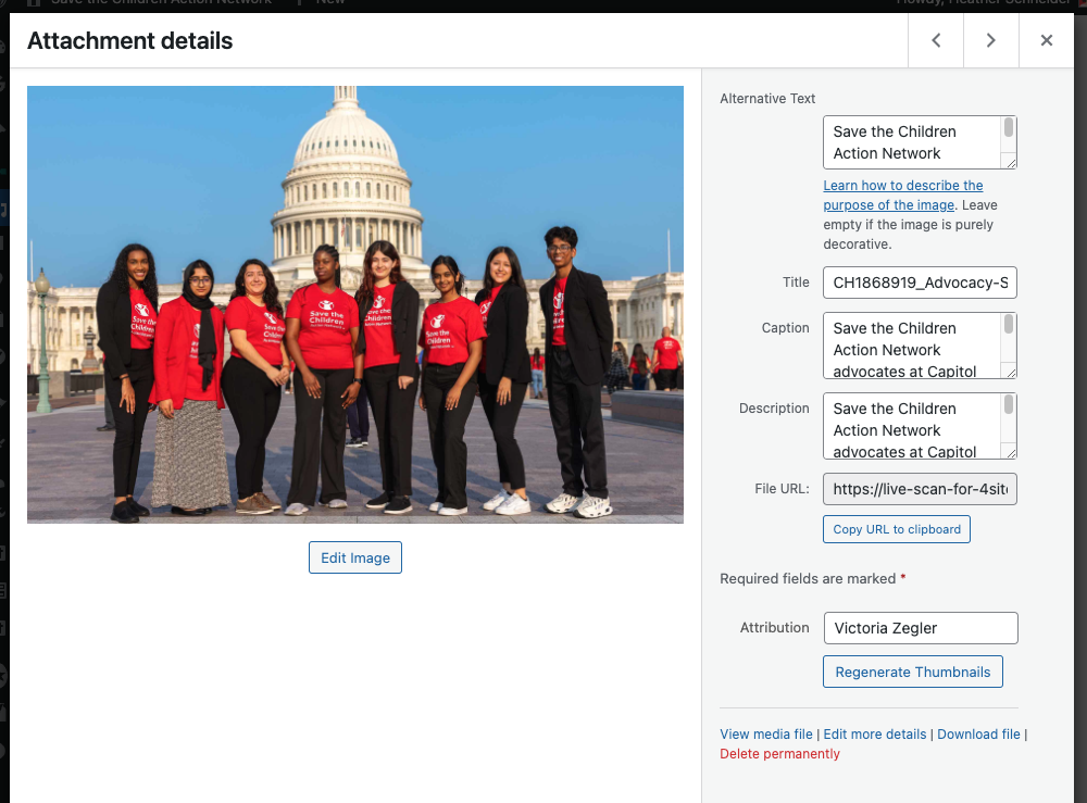
Working with SCAN’s incredible gallery made describing imagery a breeze. SCAN meticulously captured descriptions for images along with the photographers’ names. We carried this information to the new site as we added imagery and implemented a tooltip feature over images to display the attribution upon hover.
Focus indicators help users who navigate your site using a keyboard, allowing them to see which element is currently selected. This is especially helpful for people with motor disabilities who cannot use a mouse or touchscreen.
Default Styles: Use the browser’s default focus styles or customize them to be more visible.
Ubiquitous: Ensure all interactive elements (buttons, links, form fields) have focus indicators, and that they are consistent.
Conspicuous: Make your focus indicators stand out with high contrast colors or distinct outlines. “A guide to designing accessible, WCAG-conformant focus indicators.”, by Sara Soueidan, details specific examples of this.
Labels are essential for indicating the purpose of form fields, making them accessible to screen readers and improving overall conversion rates.
Use <label> Tags: Always pair form fields with <label> tags.
Be Explicit: Clearly state what information is required in each field.
Error Messages: Provide helpful error messages that guide users on how to correct their input. Using additional visual cues to the message, like bright border colors around a blank field or a modal popup that lists which fields are missing, are a bonus!
Designing a website with accessibility at the forefront of your planning doesn’t have to be a daunting task. Rather, it’s about incorporating small, thoughtful adjustments throughout the design process that can make a significant difference in ensuring that everyone, regardless of their abilities or disabilities, can enjoy, interact with, and benefit from your website. Not only does this widen your audience, but it also enhances your site’s usability and makes it more user-friendly. Plus, it can be an exciting and engaging challenge to find innovative and creative solutions that cater to all users. These solutions not only help in making your website accessible but also in making it a better, more inclusive space.
Subscribe to the Engagement 4Cast.