How can we help?


The Engagement 4Cast
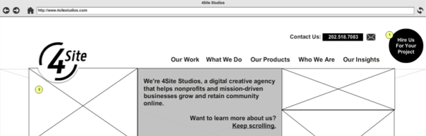
This series outlines our project process through the lens of our development of the new 4SiteStudios.com. In this post, we will discuss our process for developing an user experience for our new website.
As we have been planning the new 4SiteStudios.com over the past few weeks, we have followed our typical project process. After I developed the content plan for the new website, I dove right into developing wireframes, taking into consideration things like messaging hierarchy, information architecture, content models, modern design trends, and the lot.
In my mind, our new website is a framework. We are putting into place a foundation to build a great digital experience that can be a showcase to our clients of how we work and how awesome we are at what we do. The site will be a conversion machine. But, it will take time and learning from user behavior to get there. So, we need to start simple.
My goal is to present visitors, with as little content as possible, the following in order of priority:
The work we have done (As we say in the agency world: “The work sells itself.”)
The spectrum of services we offer
Who we are as a company
Our thought leadership around creative content and user engagement
If you take a look at the user personas in our content strategy, you will see that our target audiences are looking to make a quick decision about hiring us. They will visit our website to look at our portfolio, get a sense of the services we offer, and maybe read some blog posts or other resources. We need to give the user what they are looking for quickly, with minimal barrier to entry.
This was a collaborative process…as much as we could make it. I brainstormed approaches and ideas with John and Alexis almost daily. I would have informal powwows with them to get their thoughts on how to structure content regions and get feedback on the wireframes as I was designing them. We whiteboarded, drew out ideas on napkins,, and debated a lot. In the end, we made Jeff Gothelf proud – we were lean.
The direction I took with the homepage was a stacked pane approach, as seen with many modern websites. It made sense for what we wanted to accomplish – create very distinct regions, each communicating a key message.
Since we don’t have, nor can we produce, a lot of content for the new website, I made each top-level navigation item a distinct landing page, and each subpage under it a defined region within the landing page. I then used conversational headers and intro text to tie these regions together into a narrative. With our new brand, we want to be more conversational with our content, so this approach makes sense for us.
I am a big fan of repeating patterns within websites so users can intuitively know how to navigate through content. Aside from our main navigation, Sliders are used consistently throughout the website to allow users to scroll through pages where there is content they will want to consume in isolation, such as a service descriptions. Exposed dropdown filters are used to allow users to easily find content within large groupings, like our portfolio and “Insights” page. Galleries will be displayed using a masonry layout, and listings of content in a grid layout.
If you read my last post on the content strategy for the website, you know that one of our major goals is to increase leads generated through the website. You will see webforms consistently incorporated throughout subpages on the new website where we describe what we do and products we have developed. That black circle that appears in the upper right-hand corner of the website will follow people as they scroll down a page. We need to make it easy for you tocontact us about your next project, right?
The user experience is not complex. We want to keep the new website simple and clean; prioritize visual communication over written content (with the exception of our thought leadership content); and build a conversion machine. We will be improving the website over time, testing out landing pages and improving the design and copy based on user need, so we did not want to over-engineer anything.
Now, I know I make the process of creating the user experience sound like it was easy, but it was kind of painful. Creating a content strategy isn’t hard – much of it is conceptual and you don’t know what you get until you start building it. People respond more to visual queues, so the amount of feedback on a project increases exponentially the more people get to see what a website is going to look like.
Although wireframes are meant to communicate content structure and page layout, people easily get hung up on the details.
“Can we change that word to {blank}?”
“Are we going to have a slideshow on the homepage?”
“It would be REALLY COOL if {blank} did {blank}?”
You have probably heard at least one of those questions before…
It took work to get our team’s consensus on the wireframes. The key was to make people feel as though their feedback was important,, but allow them to give “just enough” feedback to gather the requirements you need and build buy-in amongst your stakeholders. Perfection is the enemy of good.
Setting parameters around what I needed feedback on and how long people had to provide their feedback was extremely helpful. Changes and feedback at the end of the process were minimal because I spoke with people throughout the process, allowing them to give feedback along the way.
It is also important to stress to people that project planning is an ongoing process. Just because you reach a point where you stop collecting feedback on wireframes doesn’t mean changes cannot be made at a later time. Planning documents should be living documents that are updated throughout the development process as requirements change.
Looking back on the process, I feel like I spent too much time on the wireframes. Part of the challenge with wireframes, as with design mockups, is that people cannot easily visualize how things will look and behave in the browser. Spending hours making really nice, static wireframes is counterproductive. It won’t allow people to interact with the concept and get a true sense of the functionality. The feedback you receive will be incomplete because the experience will be incomplete in the mind of the reviewer.
There is an argument to be made for high-fidelity wireframes. Interactive wireframes and prototypes communicate function well, but not form. There needs to be a balance. The compromise for me is “mid-fidelity wireframes” – wireframes that include just enough design aesthetic so the viewer gets a sense of the design page layout and form, but does not dictate the design direction.
We have already begun to refine our process to incorporate interactive wireframes and/or prototyping. There are a few ways to approach this, and we are planning to either create interactive wireframes within Mockflow, our preferred wireframing tool, or go right into prototyping using Drupal, depending on the project.
Take a look at the wireframes for our new website below and let us know what you think.

New 4SiteStudios.com Wireframes from 4sitestudios

4Site Interactive Studios is a talented troupe of web professionals who are passionate about creating tools to support digital marketers. We love to hear from our community! Reach out to us with your thoughts and questions. And don’t forget to subscribe below to get notified when we post new blogs – no spam, just content👍🏼
Subscribe to the Engagement 4Cast.